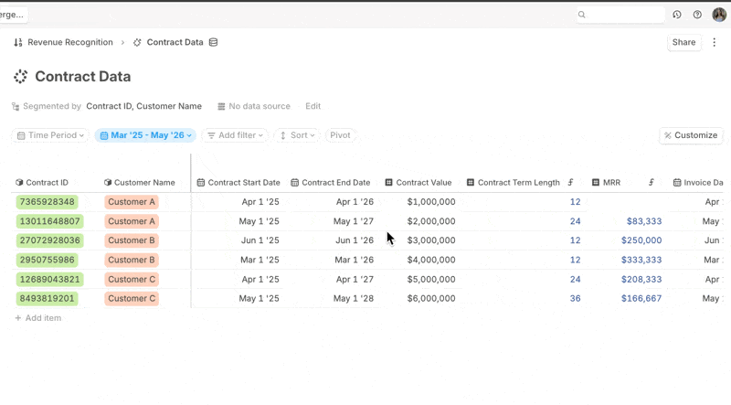
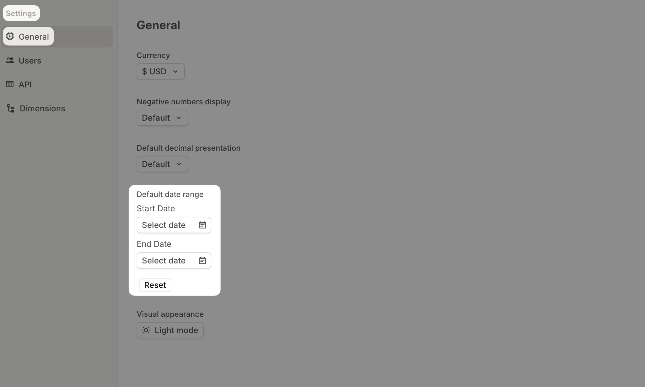
Default date range
Whether you're setting up a new page, building a forecast, or writing a formula, you now have more control over how dates work — by default, and by design.
Set one date range for your Runway org
Tired of adjusting the date range every time you visit a new page or open a detail pane?
We've made adjusting dates a global setting in Runway.
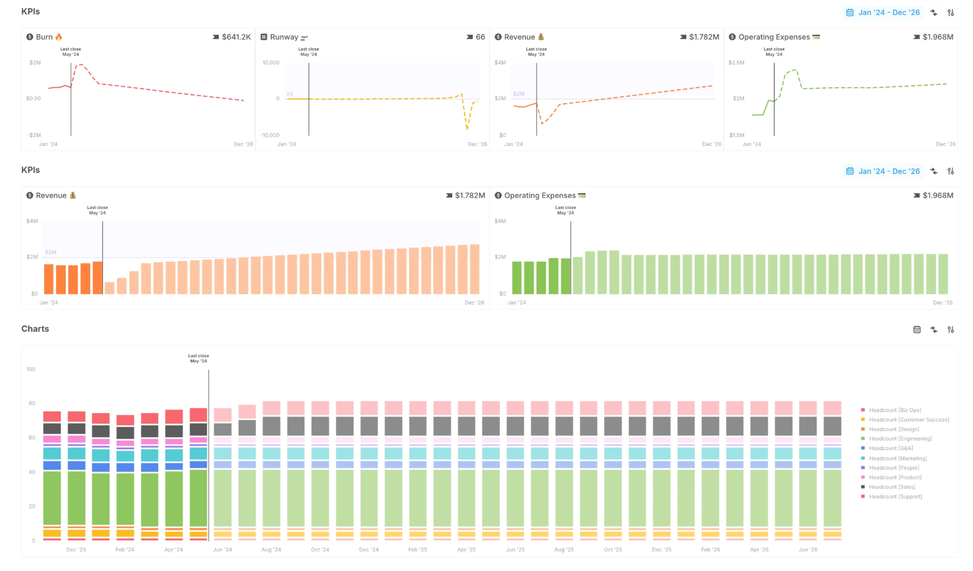
You can set a Default date range for your entire org under Settings → Default date range. Any new pages or databases will automatically use this range — unless you override it at the block or page level.
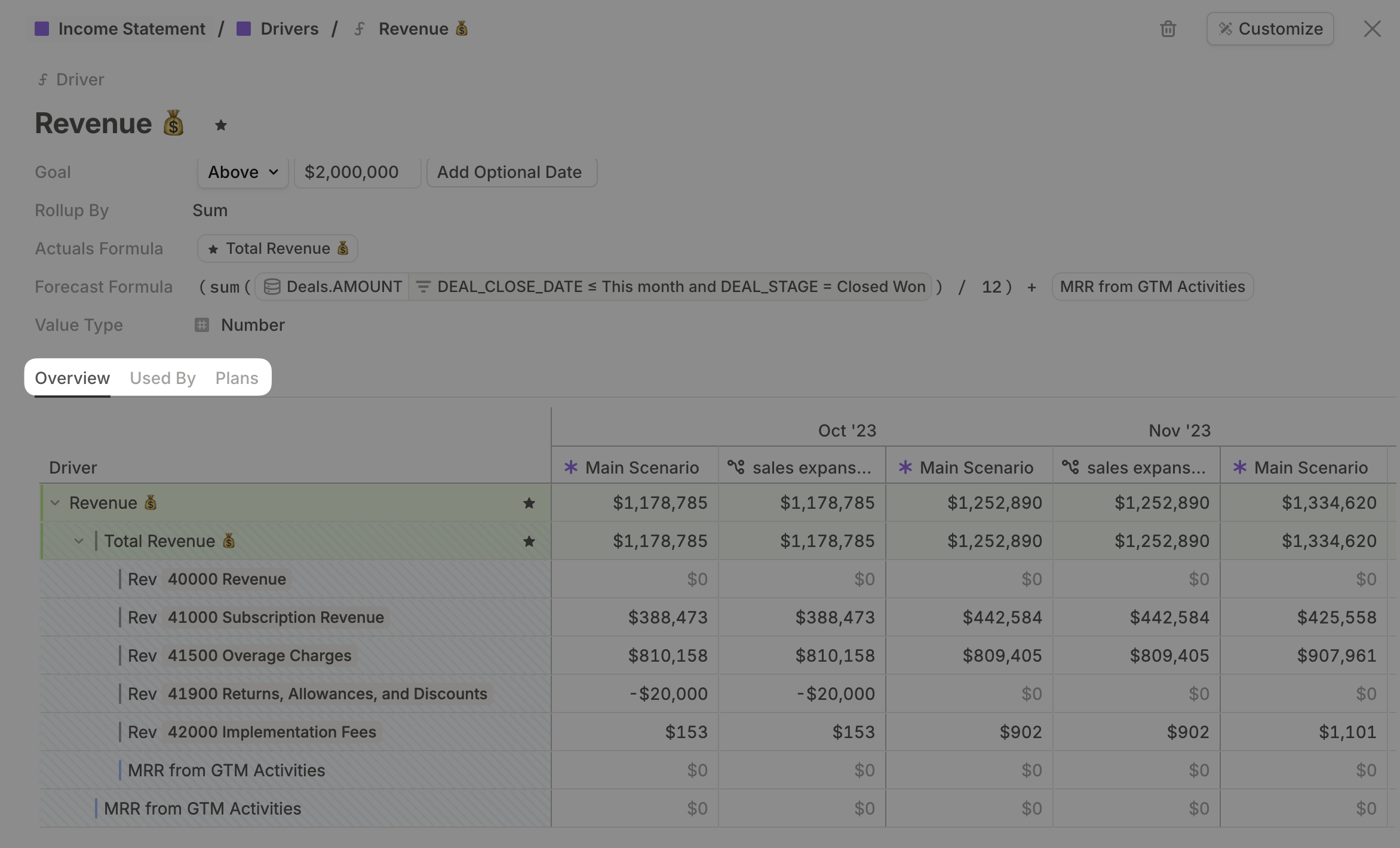
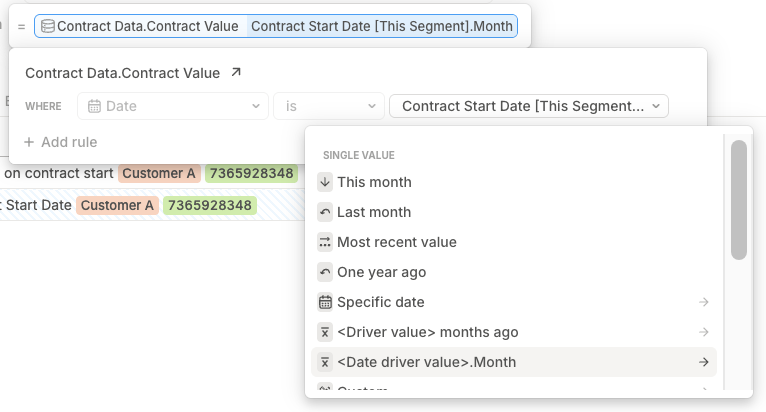
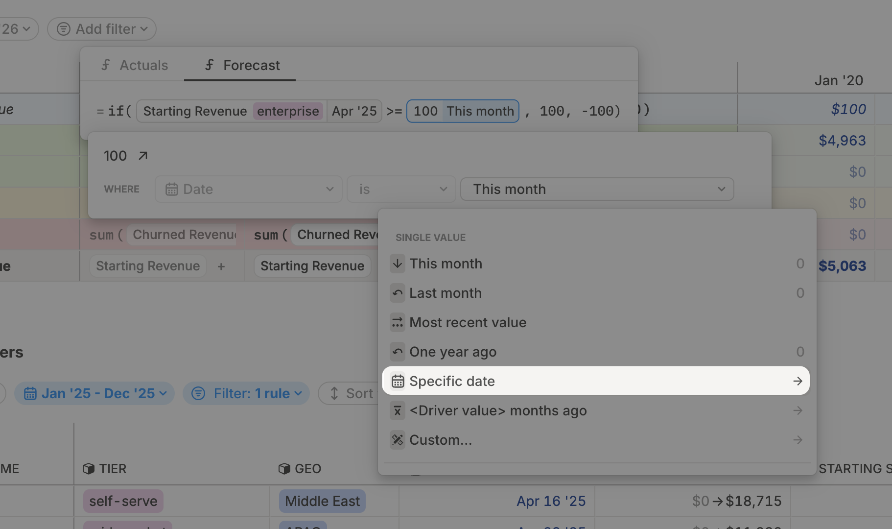
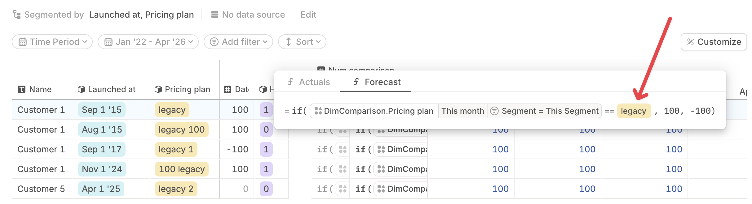
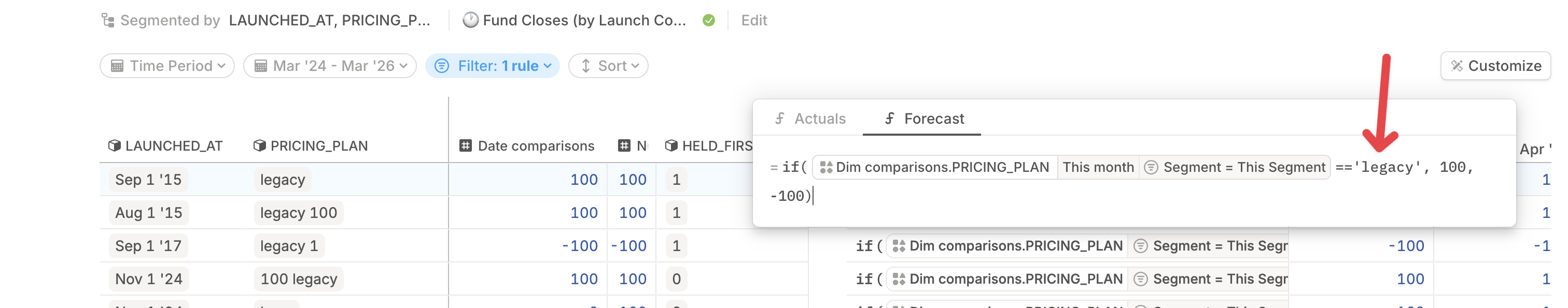
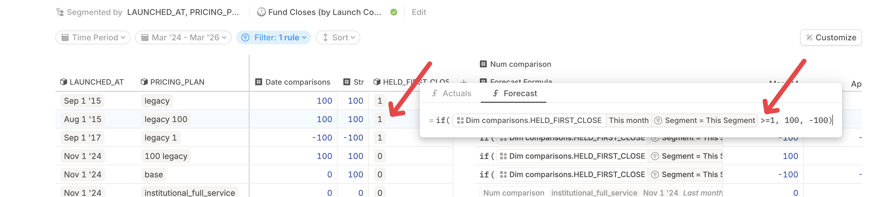
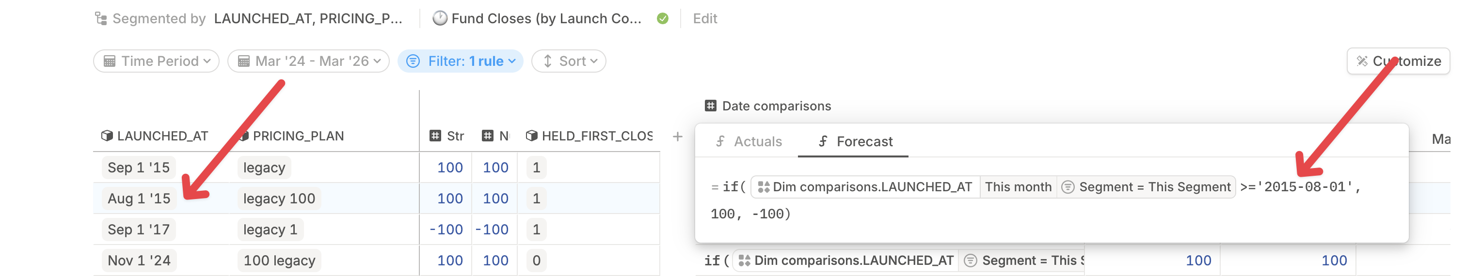
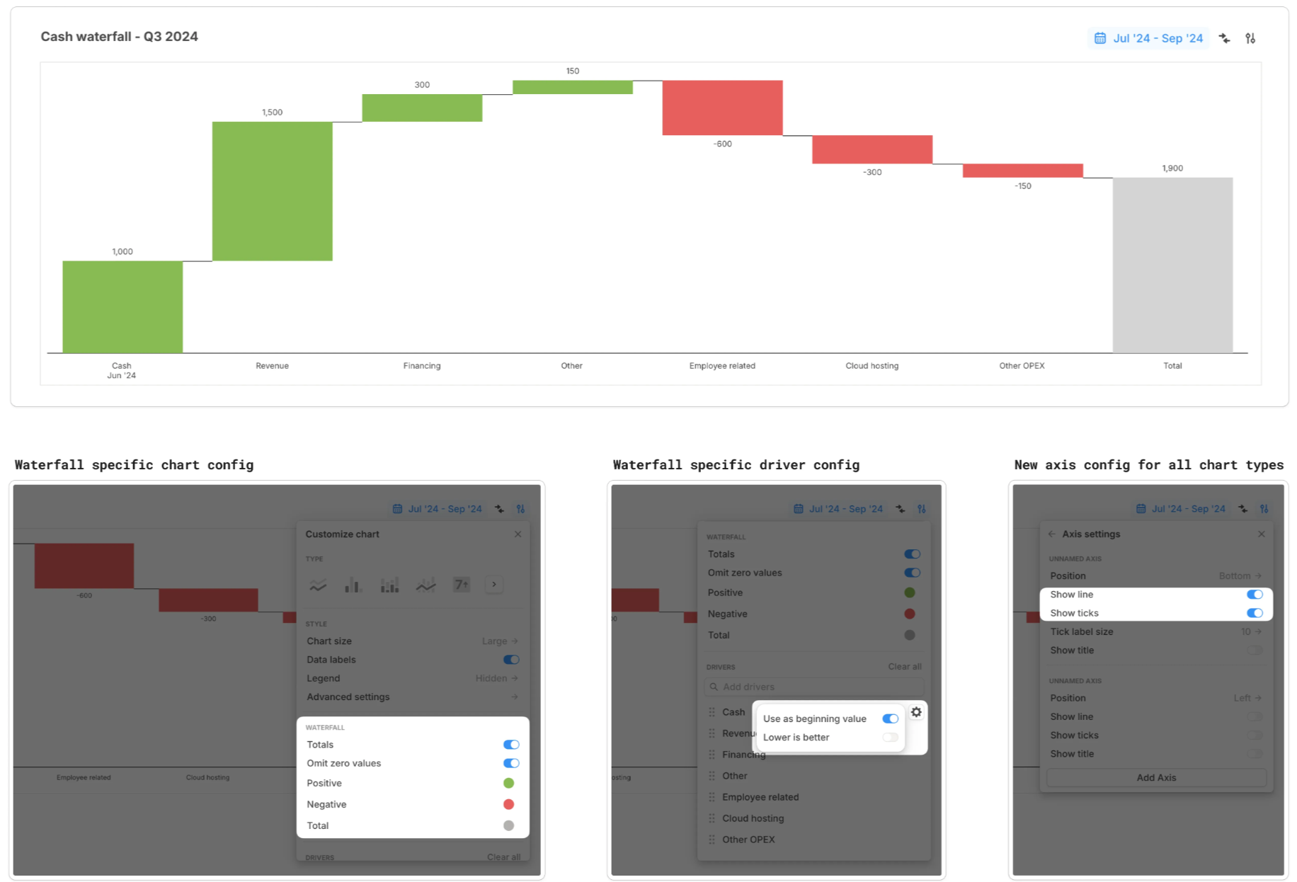
Reference fixed time periods in formulas
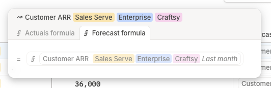
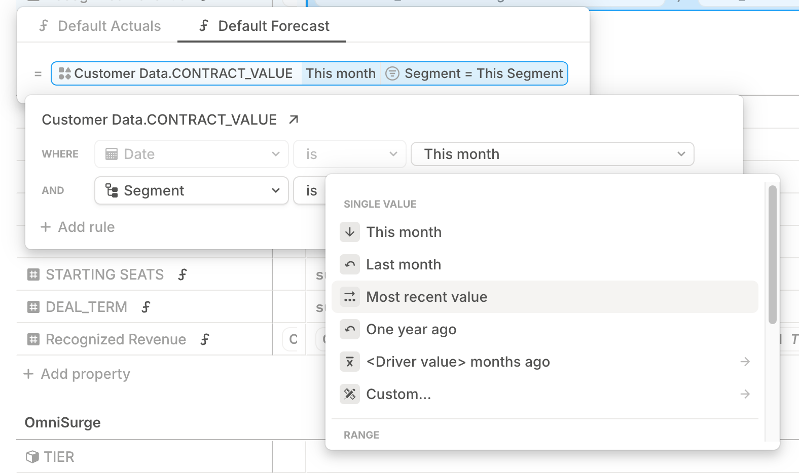
Sometimes you want a formula to shift with time — like “last month.” Other times, you want it anchored to a specific window — like Q2 of last year.
The formula editor now accommodates both options. By referencing Specific date ranges, you can lock a formula to a fixed period. Great for benchmarks, campaign retros, or anything that depends on a specific historical time range.