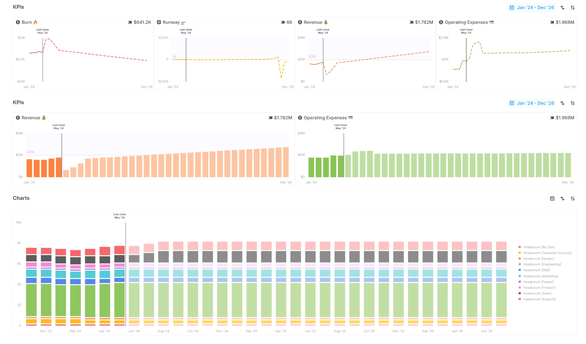
Good charts don’t just display numbers—they make insights obvious. These latest updates make it easier to see exactly what’s changing, why, and where your actuals end & forecasts begin.
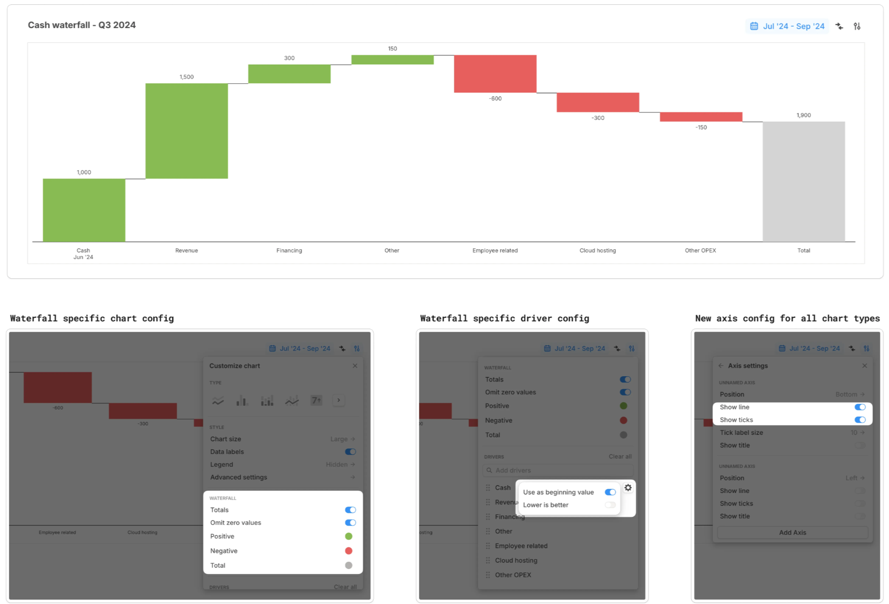
Waterfall charts show how each piece adds up
Waterfall charts are here. They break down how key metrics like cash, revenue, and expenses evolve, step by step.
- See what’s driving change — Positive, negative, and total contributions are clearly visualized.
- Control layout easily — Flip values with
Lower is better, or pull starting values from previous periods withUse as beginning value. - Thoughtful defaults — Pre-configured settings (like data labels & axis lines) make charts clear and useful right away.
Spot forecasts at a glance
Forecasts shouldn’t look like actuals. Now, they don’t.
We’ve added:
- Dashed lines for forecasts in line and area charts.
- Lighter bars for forecasts in bar and area charts.
- A vertical marker at the last close so you always know where actuals end.