A smoother way to write formulas
We’ve made writing and navigating formulas clearer and more functional.
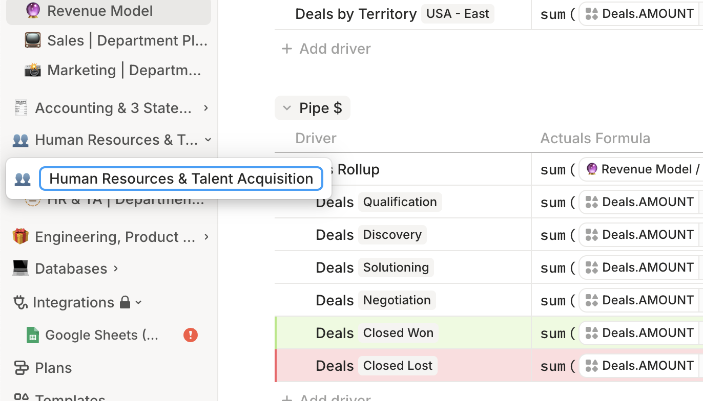
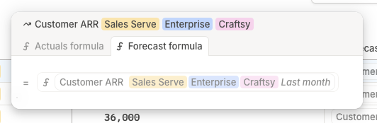
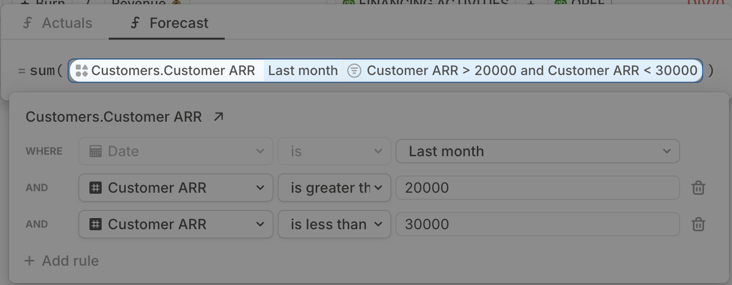
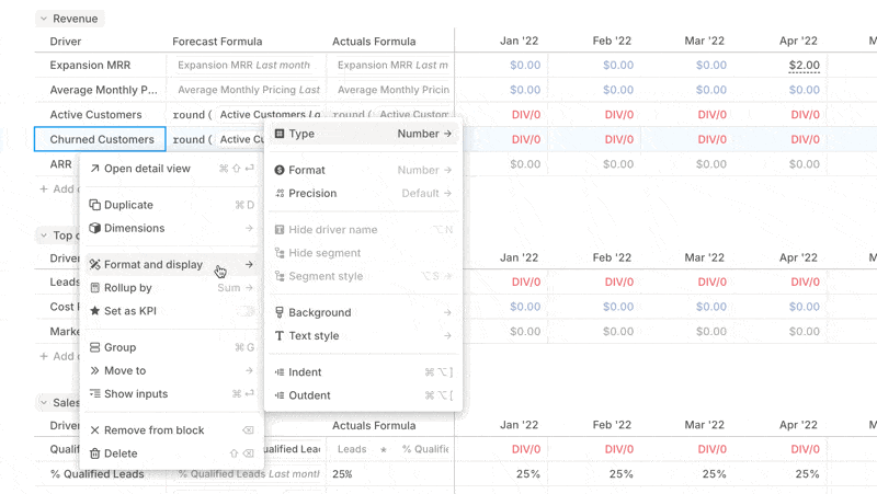
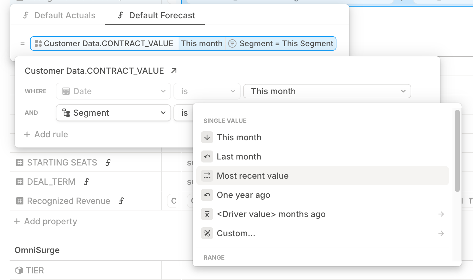
Cleaner formula editor
Driver names now show up in the formula editor, so it's clear what you're editing. UI tweaks also make complex formulas easier to read and build — especially when you’re crafting complicated logic.
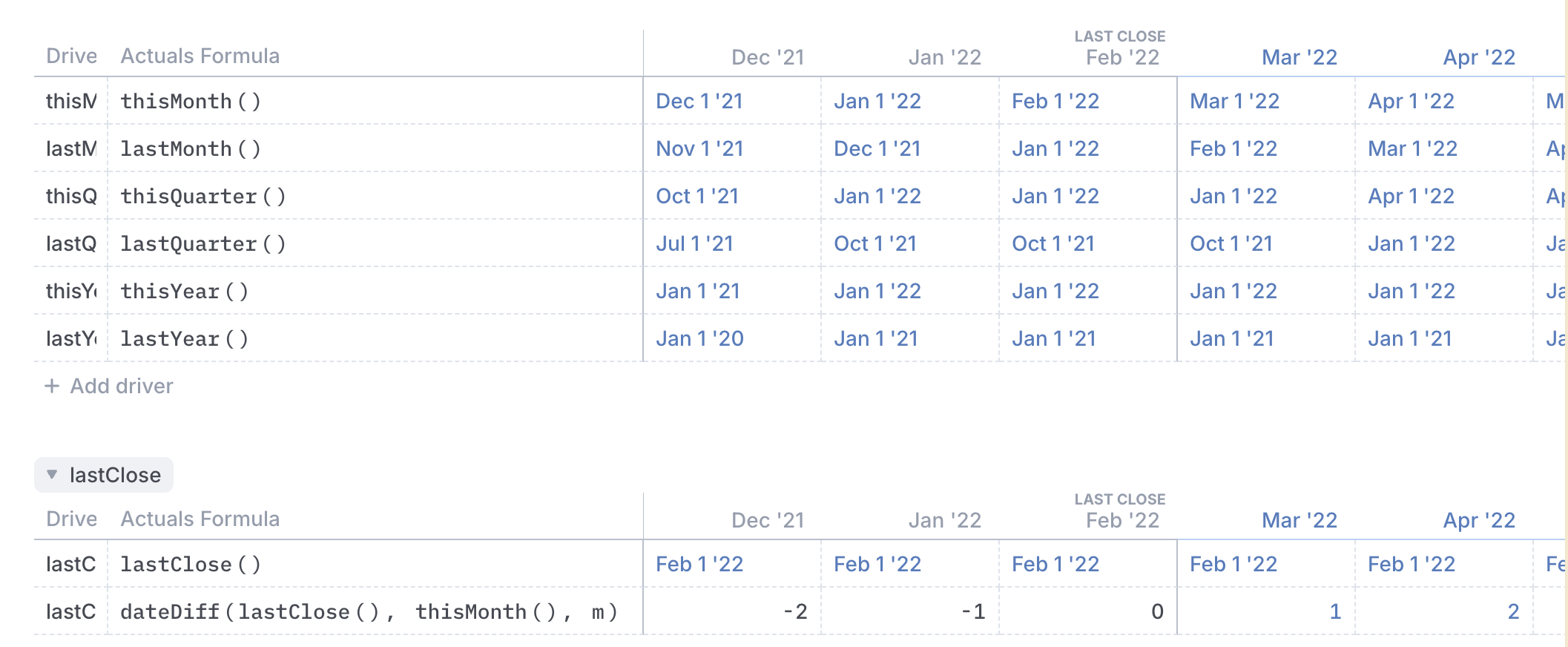
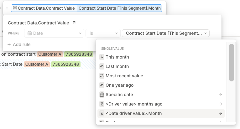
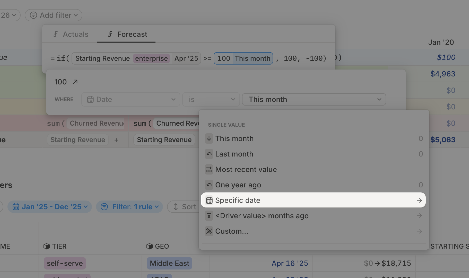
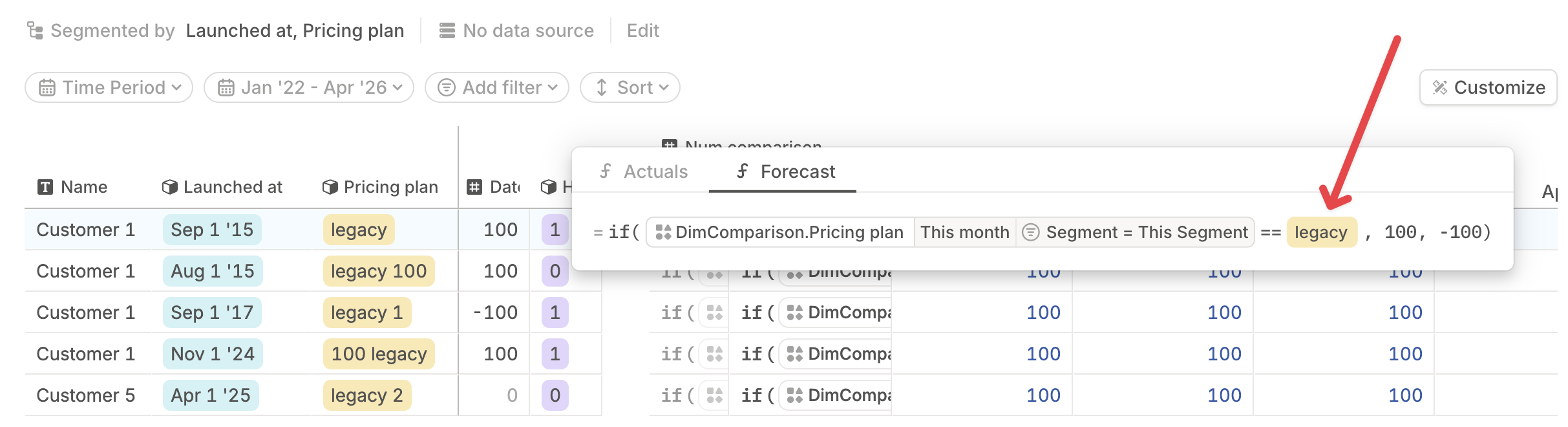
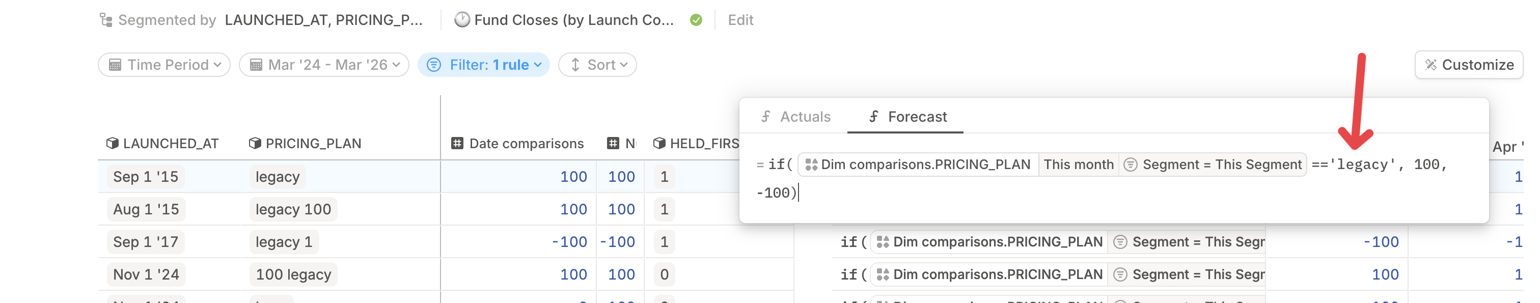
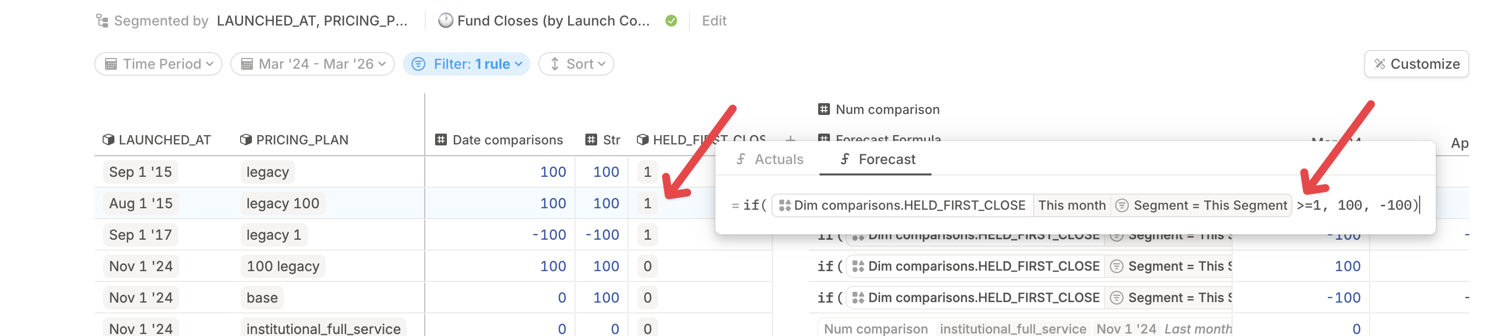
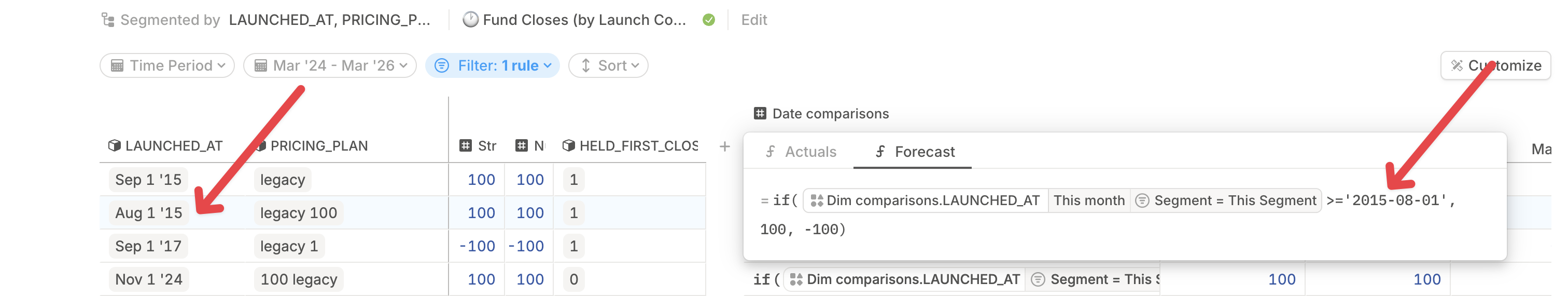
Date drivers in filters
You can now reference date drivers in formula filters. That means smarter, more dynamic logic for drivers like cohort modeling, revenue recognition modeling, or product launches where you need a time-based rule.
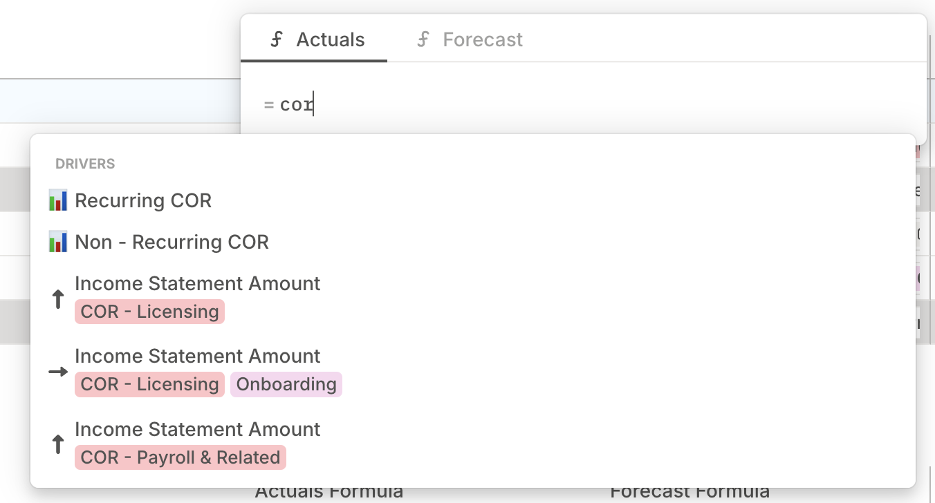
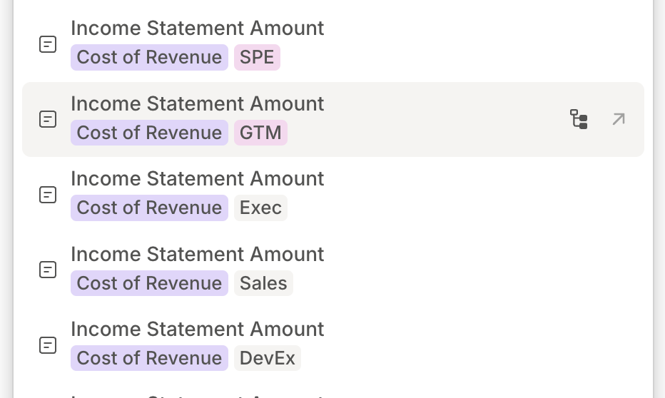
Smarter search
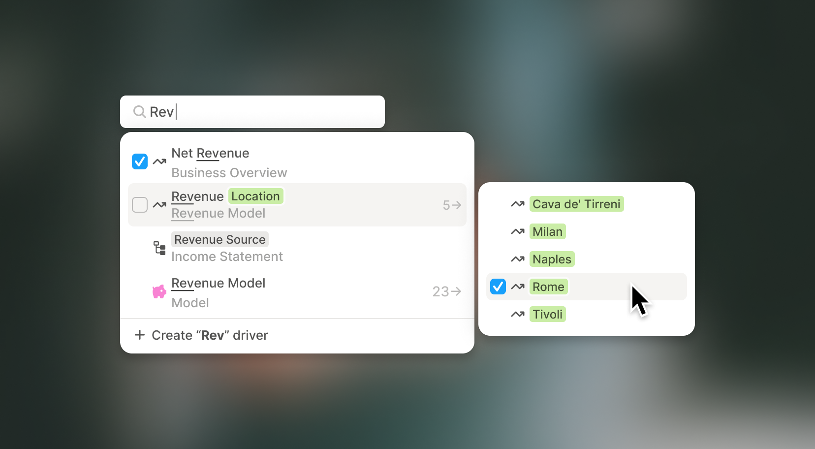
Search now returns what you actually meant to find. Now, when you type "COR," you get results with "COR" — not just things that happen to resemble it.
You'll also see dimensions and metadata right in the dropdown, making it easier to pick the right driver at a glance.
= just works
You can now use a single = for comparisons, just like in spreadsheets.
We still support == if you prefer that, but new users won’t get tripped up by syntax anymore.
A few more things we think you'll appreciate
- Collapse or expand all sidebar sections with
Cmd/Shift + Click. Great for keeping your workspace tidy. - Sidebar hover preview now shows a small icon next to the full name of an object — so it’s instantly clear whether it’s a page, model, or database.
.gif)